14 December 2009

Three Ways of Looking


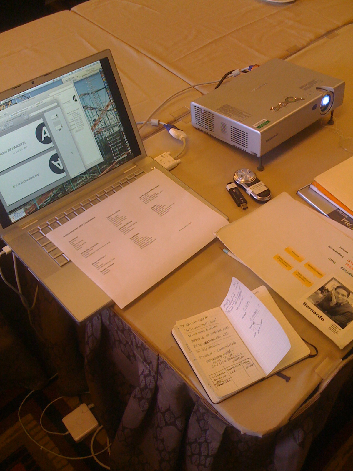
I recently spoke at a conference for the Western Alliance of Independent Camps (waic.org). Each of my sessions was a live critique and consultation for a summer camp web site. Most of these sites have been up and running, serving as primary online identities for their camps for years. They work because they have to.

One reason for their problems is a lack of vision. They are great camps. Each one had something very special about it, a very strong directorate, and a great staff. What they lacked was the ability to understand their sites as others see them.

Who are these others?

As a Machine


Google, for one. How does Google see your site? Of course, I did the "turn off the images trick" to reveal what the machine sees. I always talk with my clients about what I learned through Bruce Clay's invaluable SEO Training. Usually I hand out my condensed version in what I call the Anticonsultant SEO Cheatsheet. Most have not considered how Google approaches their site.

Looking deeper into the SEO issues for camps I found that there weren't any camps at the conference that appeared on the first page for any of their keywords (branded terms excluded). For one well-respected camp in Colorado, "colorado, summer, camp" turned up only aggregation sites in the list. In fact, it became obvious that these aggregation sites have squatted all over the SEO space, putting themselves in between Google and the camps and holding their keywords hostage. We spent some time talking about opportunities to band together with other camps to form their own aggregation-type sites--and pulling their support out from under the aggregation sites themselves. In effect they are paying these companies for little more than making a wall between them and their users.

As a User


Online users have more in common with each other than they do with the camp subject matter experts. Heck, that's why they want to go to camp anyway. Get away from it all. One look at the amount of early 21st Century Flash slide shows on these sites let's one know that consultants and designers have more influence on them than their users. Few have watched their sites being used by users. Most would be happier if it would all just go away.

As a Friend


This for me was the eyeopener, perhaps the most valuable and most recent development in my thinking. What is on your site that you would recommend to a friend? This is the simple way to think of making contact with the social net. When you have a friend, you know that you make yourself more valuable to them by recommending things to try that they wouldn't have known themselves. Things that have value themselves. Aside from contact information and forms to download, most of these sites are devoid of things you need.

It's too bad, really. These camps have many pieces of specialized information to offer. Kids and adults learn a lot when they go to camp. Not just through experiences, but how to light a fire, how to identify plants, how to etc etc. and in some cases very specialized information that few others offer. What are ways these camps can show their value to an online audience using the social network as its means?

This discussion lead to others, but one of them was a look at the struggle between leading a camp and participating in the online world. To many of these camp directors the online world is just about as far from their interests as possible. Necessary, but boring and counter to their own strengths and the strengths of their camps. This is a critical issue for consultants in all fields, but in this one it is set off in the most stark manner. Pull the camp director out of the woods to become a specialist in the ever-changing online world.

Labels: , , , , , , , , ,

10 October 2009

Soul Food Farm - rising from the ash

A film I made about Soul Food Farm in Vacaville, CA.

On 3 September 2009 a wild fire swept through this small, family run chicken farm. It seemed like the end of the business. Friends, family and the larger community are joining together to bring Soul Food Farms back to its feet.

Links to information about the fire and how you can help.

http://soulfoodfarm.com/blog/
http://soulfoodfarm.com/csa_faq.html

21 August 2009

Does anyone remember astronauts landing on the moon?

Yes?

Do you think they got there (caveats accepted) by asking questions like this?

Does Great Design Just Happen? AHH!


LinkedIn discussion here.

Why are groups like Interaction Design Association still opening up this question for discussion? Softball question exercise? People are bored? Just checking in? What the heck is wrong with people?

It's like some people like to crawl. Stay low to the ground, that way, when you fall, and you WILL FALL, you won't hurt yourself. Where are the interesting questions being asked? Where are designers reaching for the stars? Is it me, or is it just Friday?

13 May 2009

anti-consultant overtakes SiliconGorge.com


I recently created a persona on Twitter called "anticonsultant". I have thrown around the term for years, but never crystallized it. Now it is moving forward. 500+ follows in two weeks. It is coming time to make a shift.

In the next weeks I am going to change "silicongorge" to "anticonsultant.org". It is where I have always wanted to go. And look out for the Anticonsultant Manifesto. I mean, no offense, really, but it is overdue.

Labels: , , ,

07 November 2008

Concept: Design Board


From time to time working for a large corporation with little design support breeds an interesting idea. This one came to me when I realized I was swimming in a sea of business people who could not support me, or often even talk with me about design and its role in the products we develop.

I call the concept "design board".

Companies or organizations with small design teams (or teams of one) would field a board of local and remote design resources. These people would come from a variety of places: design firms, ad agencies, similar (but not competing) companies, and perhaps cohort designers or design leadership. For a fixed fee, these board members would prepare for and attend regular design review meetings. Also, they would agree to be on-call for the sort of advice senior level design support would provide if it existed in the board's company.

What does the company get out of it?

  • Expertise of a gifted group of designers.
  • Sounding board for new approaches--sanity check for the business interests.
  • Enrichment of the company's in-house design team.
  • Additional name recognition for the company's design efforts.


What do members of the board get out of it?

  • Cash money.
  • Recognition for design experience.
  • An enrichment of their own skills in a wider variety of circumstances.
  • More interesting Curriculum Vitae.

Labels: , , , , ,

07 October 2008

Visualizations, Innovations Overview


Well, here goes. Here is a quick view at the innovations both visual and interactive that have come out of my shops since 1997. I haven't included anything since 2007, but will be making some screenshots for those in the upcoming months. In the last two months there were a lot of very quiet projects with a substantial amount of thinking. Take the rethink of Western Union's transaction engine for one.

Enjoy.

process_tn.jpgITN-shorthand_tn.jpg
Left, this was my plan for creating a design structure for Internet Travel Network (ITN 1997). To the right, a quick visual shorthand for a user's travel history. It shows departure and arrival airports, travel days, and additional elements like rental cars.

flightScope_tn.gif5k_tn.jpg
Left, another design for ITN showing a great product that showed realtime flight location at a detail that would have made Homeland Security uncomfortable. To the right, the winning entry in Stewart Butterfield's 5K contest. My team at Cornell created an entire, working ecommerce site in less than 5k.

homePhotoConcept01.jpgcornell_search.jpg
Left, early design for Cornell University front page. Right, an early look at Cornell's revolutionary universal search. Both 2004.

homePhotoConcept02.jpggimme_label_art_tn.jpg
Left, another beautiful take on the Cornell front page concept. Right, a mockup for Gimme! Coffee's one pound bags showing origin, full taste profile, name, and roast.

gimme_label_tn.jpggimme2003-2006Home_tn.jpg
Left, final Gimme! Coffee label. Very close to what they use today. Right, the 2003 redesign for Gimme! Coffee's home page.

gimmeBuy_tn.jpggimmeHome_tn.jpg
Left, SiliconGorge concept for Gimme! Coffee's purchasing list. Right, evolution of design based on Learn/Buy dichotomy.

NoContext_data_31May2006_tn.jpgblob_diagram_tn.jpg
Two concept documents for a Fortune 500 customer service Web application. Left, data mapping for feature possibilities. Right, pre-historic use case clumping.

reagent_23Mar2006_tn.jpgcustomer_hub_tn.jpg
This shows the next step beyond use case clumping. Left, organizing the client's feature needs into silos. Right, further evolution of customer silo as we rapidly developed working models.

account_hubActivityLog_tn.jpgaccount_hubCommentLog_tn.jpg
Two ways for the CSR to check the health of the customer account. Left, a view of all relevant activity, changes, requests, and CSR comments at the rep's fingertips. Right, a view of CSR comment types.

managePayments_hub_tn.jpgmanagePayments_editMonth_tn.jpg
Left, the final prototype for managing a user's mortgage payment schedule, featuring a 12 month schedule. Right, zoom into a monthly view.

transactions_tn.jpgintegrityWarningAddC#309767.jpg
Left, the projected transaction schedule for all user payments. Right, a special comment type generated by the system warning CSR of integrity problems with the account.

theWall_tn.jpgedwardInProcess_tn.jpg
Evolving the payments persona presentation. We mocked up Edward's persona on a cork board before creating his 5 companions. Left, the persona wall. Right, the cork workspace.

bernardo_tn.jpgUser_Research_Report_tn.jpg
Left, a final proof of the persona concept tool. Right, another persona tool: a research report for a small business payments product.

360_desktop_tn.jpg360_smartcard_tn.jpg
Left, paper prototyping for Desktop payments application, the most trusted electronic payments space for the user. Right, concept model for debit card-to-payments card interaction.

appropriateness_tn.jpgubiquity_tn.jpg
Two grids used for developing our 360 concepts. Left, showing appropriateness of venue or method to payment type. Right, matching location and method access.

controlExcerpt_tn.jpg
An example of our work in defining Control for electronic payments.

Labels: , , , ,

02 October 2008

The Role of Control in Ecommerce and User Experience


Recently Company XX conducted a study of On Demand Electronic Payments that identified Control as one of the key limiters of consumer adoption of electronic payments--for those participating in the survey who were very familiar with online payments, Control was even more important.

The study firmly established Control as a primary concern for my company, Company XX New Product Development in marketing efforts and creating customer experiences. Yet, when we tried to use the concept to improve new products, it became clear that it was defined too broadly. Finally we isolated seven shades of meaning for Control, focusing on the concept's relevance to product utility and user interface.


Simple to understand


Our company and its products should strive to be simple and easy to understand, but do customers understand what Company XX does for them?

What if Company XX isn't simple to understand?

As the complexity of a company and its associated message (or a concept and it associated tasks) increases, customers feel increasingly helpless. They lose Control.

The concept of moving money is a simple one. It's clear that with regulation and the increased complexity of making our processes digital, the execution is not as simple as the concept.

We must work to balance our descriptions of the execution of moving money with the customer's need for a simple, clear concept.

Can our customers describe-in plain language-how Company XX products work?

Consider These:
A key, a pass phrase, a secret handshake: automated authentication is a networked version of a simple, age-old concept.

The switch has many applications. Recognizable from across a room, the simple switch establishes our options and limits our expectations at a glance.


Easy to use


Company XX should ensure that, to our customers, using our products is second nature.

What if our products aren't easy to use?

When customers cannot manipulate the "handles" of a financial product, they have literally lost Control over their own money. Understanding what a product does is one thing, being able to use it is quite another. Each implies a form of Control to our customers.

When a product's ease of use is out of balance with its simplicity it causes a grating frustration.

Company XX should ensure that, to our customers, using our products comes as second nature.

Tracking a Package
A 3-5 day delivery with tracking seems shorter than a 3-5 day delivery that just shows up.

A Simple Search
Doing without the power of Boolean operators or "regular expressions" may mean that your simple search returns billions of results, but it's easy to use. "You type something. You get results."


Precise


Do our customers take advantage of the precision controls that our products offer?

What if our products aren't precise?

Imprecise tools do not allow the customer to communicate their desired use of the product.

Once customers understand a product, and know how to use it, they start to see how it could meet their specific needs. A sense of precision builds customer confidence in the promise of the product.

An easy to use, precise tool can capture the attention and the imagination of customers. Precision can make a simple tool seem personal.

Company XX products should enable customers to predict specific outcomes and confirm successes.

Electron Microscope
What if a researcher had the power of the electron microscope without the ability to choose where to focus it?

Travel Web Sites
What if travel sites didn't allow you to request specific departure and arrival times or choose an airport? What do you want to Control more precisely when you travel?


Transparent


Can our customers see their money when it's in our hands?

What if our products aren't transparent?

An invisible process appears to be out of a customer's Control even if it's running perfectly.

Allowing a user to monitor a task—even an automated task they cannot directly Control--still offers a sense of Control.

Company XX should provide a window for our customers to monitor the progress of any task.

Consider the following:
Secret committee meeting v. CSPAN coverage of Senate debate.
A citizen's ability to affect the outcome of either proceeding may be zero, but awareness lends a sense of Control. Transparency enables the customer to predict the outcome even when they cannot manipulate it.

Tracking a Package
A 3-5 day delivery with tracking seems shorter than a 3-5 day delivery that just shows up.

At the races
Horse racing without transparency is just a low payout Super Lotto with better odds.


Trustworthy


Do we foster and support our customers' feelings of trust for the Company XX brand?

What if we aren't trustworthy?

An exchange of personal information is a major part of the relationship we share with a customer.

Sharing personal information with an untrustworthy party is irresponsible; a customer does not want to lose Control over their personal finances.

When people put personal information into the hands of others the only Control they retain is the sense we call trust.

A customer determines their level of trust prior to forming a business relationship.
When a customer feels they have lost Control over a relationship, they ask themselves, "Can I really trust this company anymore?"

Company XX should jealously guard the privacy and security of each aspect of our customer's relationship with Company XX.

Consider These:
The Break In
Compare how you felt about your home before and after the "break in". What was once intimate and comforting became lost and foreign.

Tik, tik, tik, tik...
For a moment, the front car overlooks the entire amusement park. Peaking, it plummets straight down. As it turns, the rails groan loudly. What part did trust play in your decision to ride?


Continuous


To our customers, Company XX is one, massive, continuous entity. Do we give them Control that matches their concept?

What if our products or services lack continuity?

Internal delineations among a company's products and services—including technical, procedural, and legacy delineations--do not exist for the customer.

When a company does not support continuity from one product or service to the next, the burden is placed on the customer.

Since customers expect continuity from the companies they do business with, maintaining continuity for a company is a burden customers won't bear too long.

To those on the outside looking in, Company XX is one, continuous entity.

CRM Systems
CRM solutions often do not match the model systems in the customer's head.

Google Universal Search + Maps
Enter one search query and it can be compared against all of Google's search indices.
It's difficult to imagine it not working that way.


Ubiquitous


Can Company XX customers access and use our products and services when and where they need them? When a customer uses a Company XX product, Company XX has Control of a customer's money.

What if our services are not ubiquitous?

When we diminish customers' access to our products and services—and thus to their money--we diminish their sense of Control.

By multiplying Company XX product access opportunities across points that our customers already use (cell, kiosk, web, contact-less, desktop, and more), we can multiply their sense of Control as we offer more opportunities to use these products.

Company XX should make its products available anytime, from any place.


Consider These:
Poor Cellphone Cover-Rage
The promise of the cell phone is one of ultimate mobility. When you hit a dead zone during a call, the dream screeches to a stop. The phone becomes a reminder of just how good the sound was on an old handset.

OnStar
Roadside assistance, remote unlock, email service reminders, disaster and crisis alerts, turn-by-turn directions, and even a concierge service, accessible from just one OnStar button.


RECAP
Simple to understand
Our company and its products should be simple, and easy to understand.

Easy to use
Company XX should ensure that using our products is second nature to our customers.

Precise
Company XX products should enable customers to predict specific outcomes and confirm success.

Transparent
Company XX should provide a window for our customers to monitor the progress of any task.

Trustworthy
Company XX should jealously guard the privacy and security of every aspect of our customer's business.

Continuous
Outwardly, Company XX products should present as one, continuous, consistent system.

Ubiquitous
Company XX should make its products available anytime, from any place.

Labels: , , , , , , , , , , , , , , ,